Creating a Sense of Home: The Signage Behind The Sparrow Apartments
When Good Shepherd Center set out to create The Sparrow, its newest permanent supportive housing community, the goal was about much more than constructing a building. The organization wanted to create a place where people who had experienced chronic homelessness could find stability, dignity, and a renewed sense of hope.
For more than 40 years, Good Shepherd Center has served people experiencing homelessness and hunger in the Wilmington area through shelter, housing, rehousing, and support programs designed to help individuals and families regain stability. The Sparrow is one of the organization's newest efforts to provide long-term housing solutions for some of the community's most vulnerable residents.
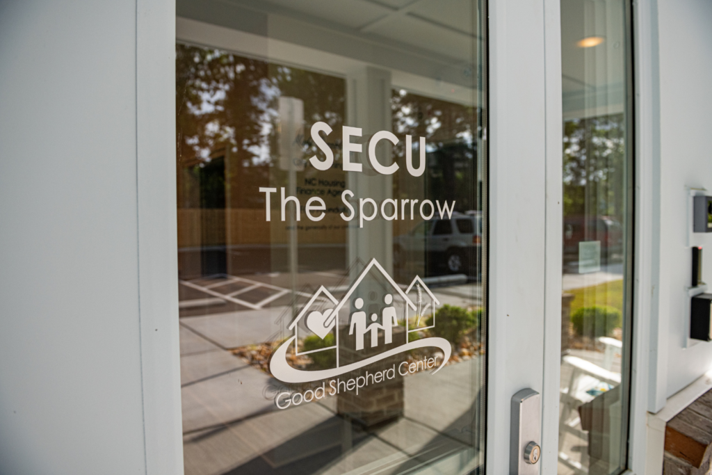
Located in Wilmington, The Sparrow provides affordable housing and on-site support services for individuals with significant disabilities who have experienced long-term homelessness. Every aspect of the project was designed to support that mission, including the signage.
We were proud to have partnered with Good Shepherd Center to develop a cohesive signage program that included a custom monument sign, ADA-compliant interior signage, donor recognition elements, wall graphics, and entrance graphics. Together, these pieces help tell the story of The Sparrow from the moment someone arrives.
A Community Designed to Inspire
For Good Shepherd Center, creating The Sparrow wasn't simply about providing housing. The organization wanted the property to challenge perceptions about what supportive housing can look like.
As Good Shepherd Center CEO Katrina Knight explained, "We want this to be the nicest-looking place on the street. We want this to be confused for luxury housing. It needs to really defy what people think of when they think of housing for 'those people.'"
The team wanted residents, visitors, donors, and neighbors to feel something positive the moment they encountered the property. That vision became an important guiding principle throughout the signage design process.
Creating a Cohesive Identity
Good Shepherd Center already had other housing communities in its portfolio, so the signage needed to feel connected to the organization's existing properties while giving The Sparrow its own unique identity.
The sparrow itself became a central design element throughout the project. More than just the building's namesake, the bird symbolizes hope, resilience, community, and new beginnings. Those themes reflect both the mission of The Sparrow and the journeys of the people who will call it home.
Combined with Good Shepherd's signature shades of blue, the imagery helped establish a visual identity that was both recognizable and distinctive. Finding the right balance between consistency and individuality was an important part of the process. "We wanted to bring in elements of some of the signage they had at their previous locations while creating a more modern look and newer feel," said Sales and Production Coordinator Sarah Bryan.
The result was a signage system that felt consistent with the organization's broader brand while creating a personality all its own for The Sparrow.
A Welcoming First Impression
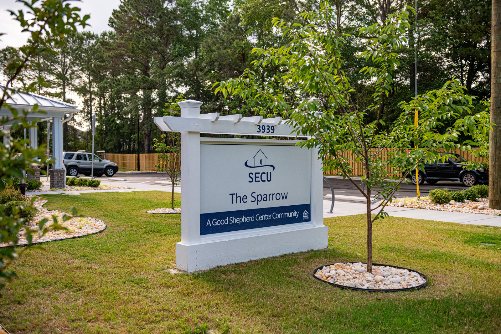
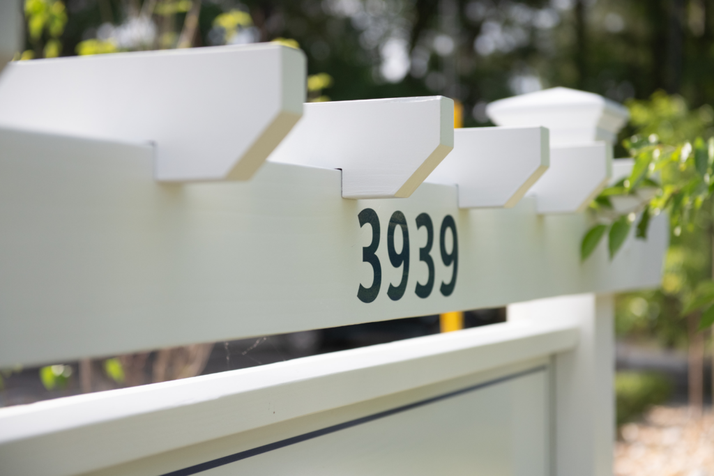
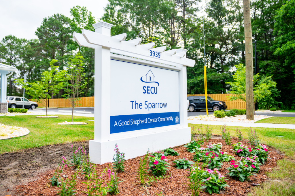
One of the first elements visitors encounter is the custom monument sign located at the entrance to the property.
The sign features a pergola-style wooden structure designed to complement the architecture of the building. Inspired by signage at another Good Shepherd property, the monument sign creates a welcoming presence while helping establish the character of the community.
Like the building itself, the monument sign was designed to feel warm, inviting, and well cared for.
Using Graphics to Reinforce the Mission
While the monument sign helps create a strong first impression, some of the most meaningful elements of the project are found inside the building.
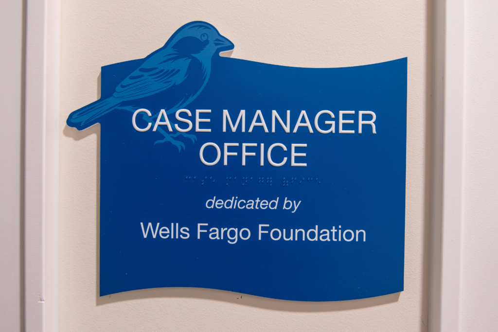
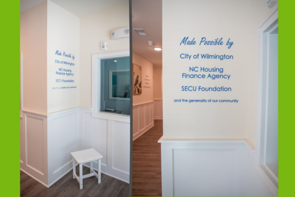
Upon entering The Sparrow, visitors encounter graphics that recognize key funding partners and supporters who helped make the project possible. Beyond those acknowledgements, interior wall graphics help reinforce the values at the heart of the community.
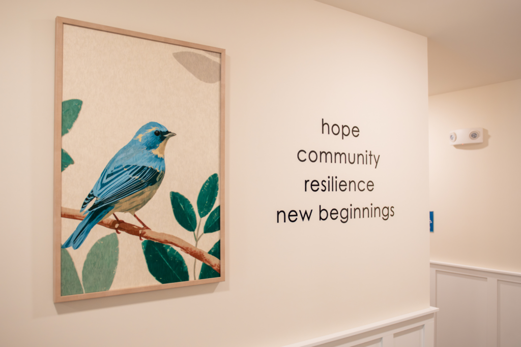
One feature includes sparrow imagery paired with words that reflect the spirit of the project: hope, community, resilience, and new beginnings.
These graphics serve as more than decoration. They help communicate the purpose behind the space and create an environment that reflects the organization's commitment to helping residents build a more stable future.
Accessibility Meets Design
The Sparrow project also represented an important milestone for our team.
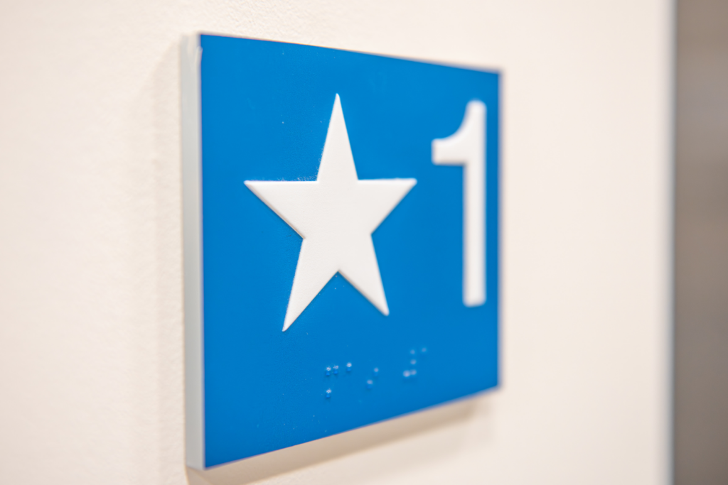
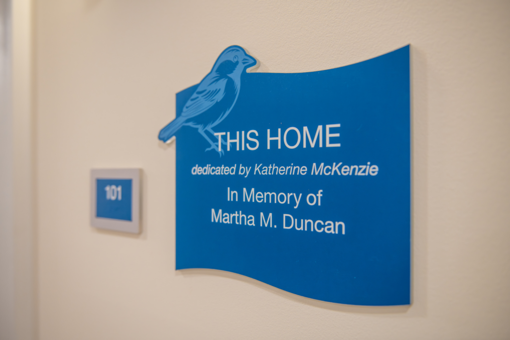
The interior sign package became one of the first complete ADA sign programs produced using our swissQprint flatbed printer. The project included room identification signs, donor dedication plaques, and ADA-compliant braille signage throughout the building.
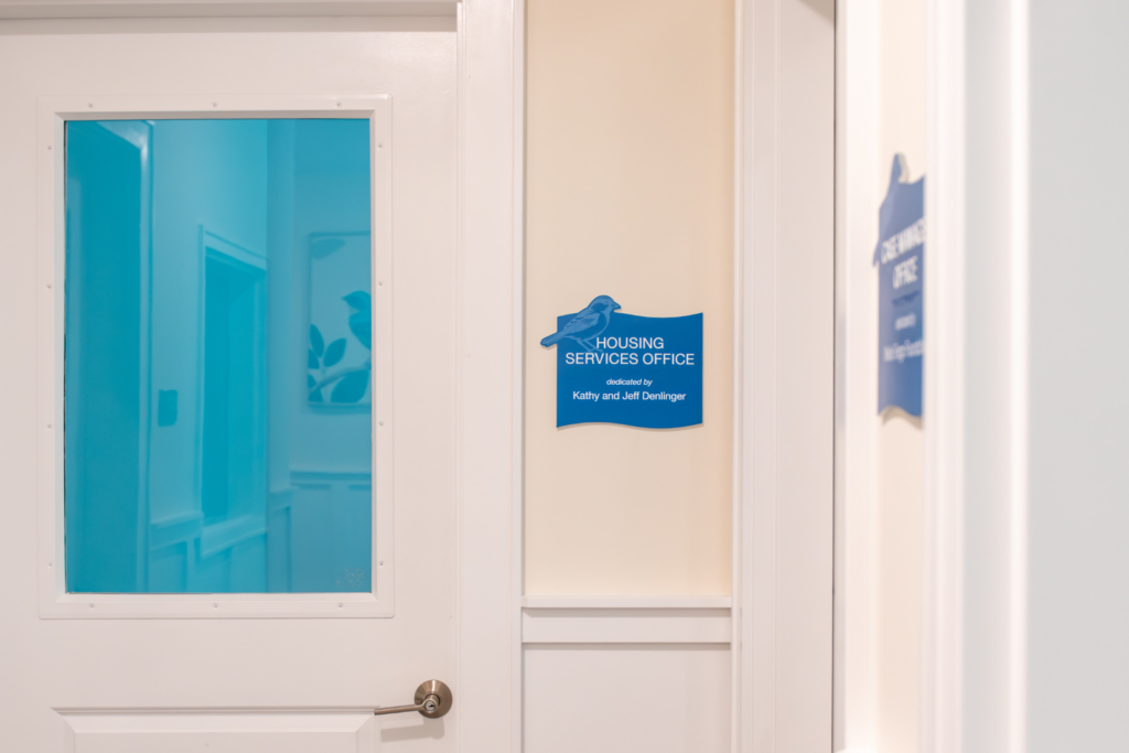
Rather than simply replicating traditional room signs, our team looked for opportunities to have our new printing capabilities improve both the function and appearance of the signs. In several locations, we combined room identification and donor recognition information into a single sign, which helped to reduce visual clutter while maintaining compliance.
Because the signs incorporated raised elements and braille, the project also required extensive testing to ensure the printed surfaces would remain durable and readable over time. The experience helped us refine our new printing processes while delivering an accessible, attractive solution for the client.
The Details That Make a Difference
One of the most rewarding aspects of the project was seeing how the smaller details contributed to the overall experience of the space.
Throughout the building, donor dedication signs recognize individuals, families, and supporters who helped bring The Sparrow to life. Many of these spaces were named in honor of loved ones, creating meaningful connections between donors and the community they helped create.
The consistent use of sparrow imagery across room signs, dedication plaques, wall graphics, and other elements ties everything together and reinforces the building's identity.
Individually, each sign serves a specific purpose. Collectively, they help create a sense of place.
More Than Signage
At Port City Signs & Graphics, we often talk about signage as part of a larger environment rather than a collection of individual signs. The Sparrow is a perfect example of why that matters.
Every element of the signage program was designed to support the experience Good Shepherd Center wanted residents and visitors to have. From the monument sign at the entrance to the donor recognition displays and ADA signage throughout the building, each piece contributes to a community that feels welcoming, respectful, and intentional.
We're honored to have played a role in a project that is helping people build new beginnings and creating lasting positive impact in the Wilmington community.
If you're planning a new facility, renovation, or community development project, contact us to find out how we can help you create a signage program that supports your goals and brings your vision to life.