
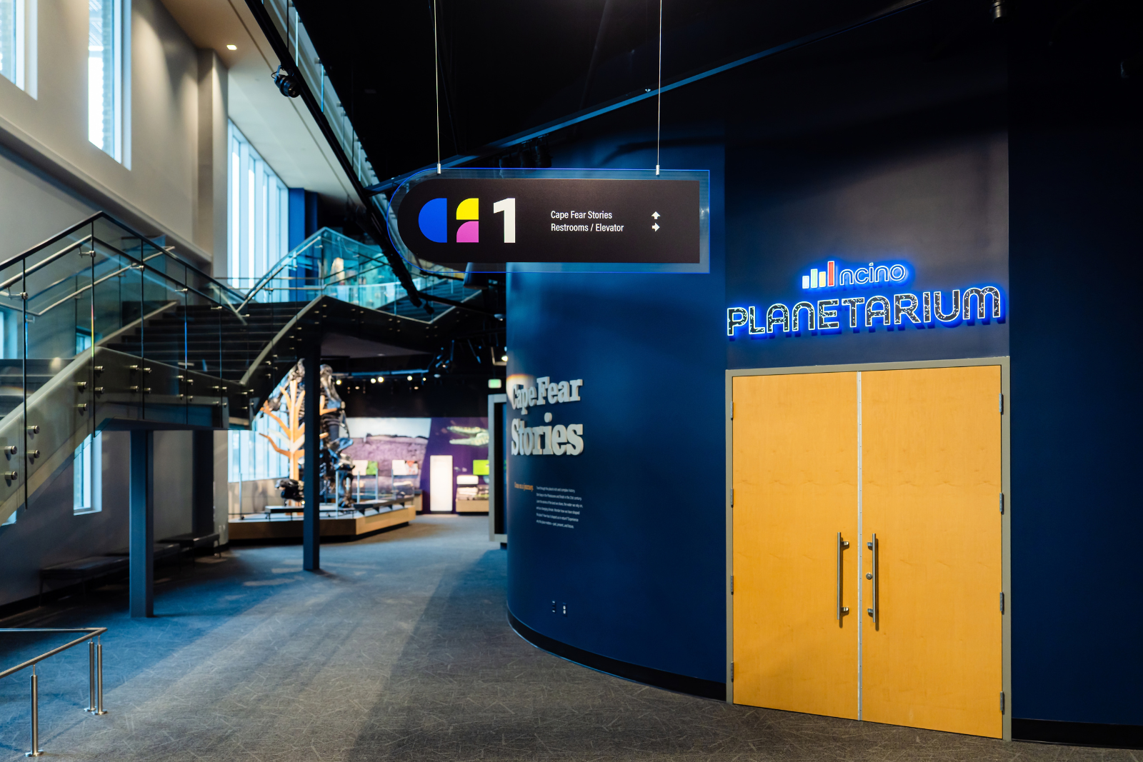
Inside the Signs of the New Cape Fear Museum
The Cape Fear Museum of History and Science has been telling the stories of our region since 1898. So when an institution with that kind of history moves into a completely new home, there’s a lot more involved than simply moving the exhibits.
Located in downtown Wilmington, the new Cape Fear Museum is part of a project roughly 10 years in the making. Its three floors include history and science galleries, children's spaces, hands-on STEM experiences, a nature terrace, rotating exhibit space, and a 60-seat planetarium.
For us, being part of a project that will play such an important role in our community was especially exciting. It also gave our team the opportunity to produce an unusually broad range of interior signage, from wayfinding that helps visitors navigate the new space to custom pieces created for some of the museum’s major exhibits and gathering areas.
One Museum, a Lot of Different Signs
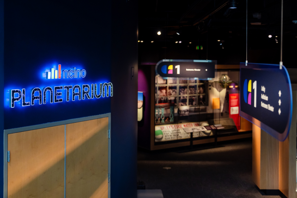
A project this large involved multiple architectural, design, and exhibit partners, each contributing to different parts of the finished space. Morvil Advertising & Design Group was one of those partners, and they designed many of the major signs we produced. Their designs took cues from the building itself, incorporating its colors, natural wood details, and the look of the exhibits.
“Our job was not to overpower the architecture, but to complement it, while still standing out enough to be user-friendly,” said Jeff Morvil, President of Morvil Advertising & Design Group.
That approach carried through a signage package that included directional and room-identification signs, illuminated and non-illuminated dimensional museum logos, classroom window graphics, specialty exhibit graphics, hanging signs, and several highly customized pieces.
Signs That Command Attention
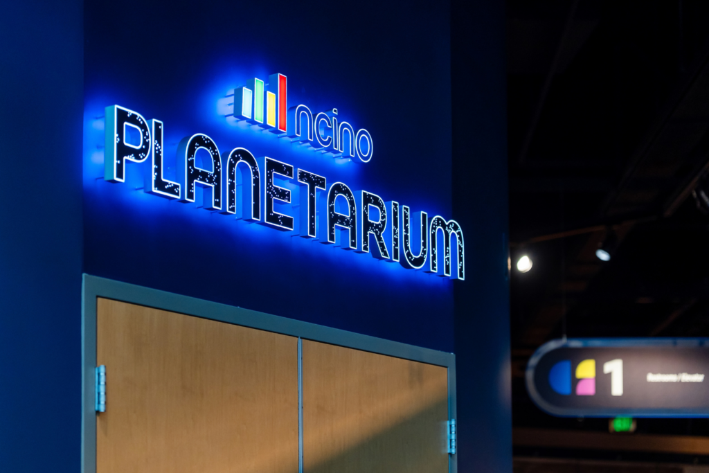
One of those is the illuminated nCino Planetarium sign. Positioned at the entrance to the planetarium, the sign features a starry effect that adds another visual layer to one of the museum's centerpiece attractions.
Creating that effect took some experimentation. Our team printed vinyl for the face of the sign and removed small stars so white light would shine through them, while color illuminated from behind.
The reaction from the planetarium's naming-rights sponsor at the museum's grand opening said a lot.
“They were really impressed with how it turned out, especially the starry lighting effect,” said Cape Fear Museum Manager Barbi Baker. “It really makes the sign something special.”
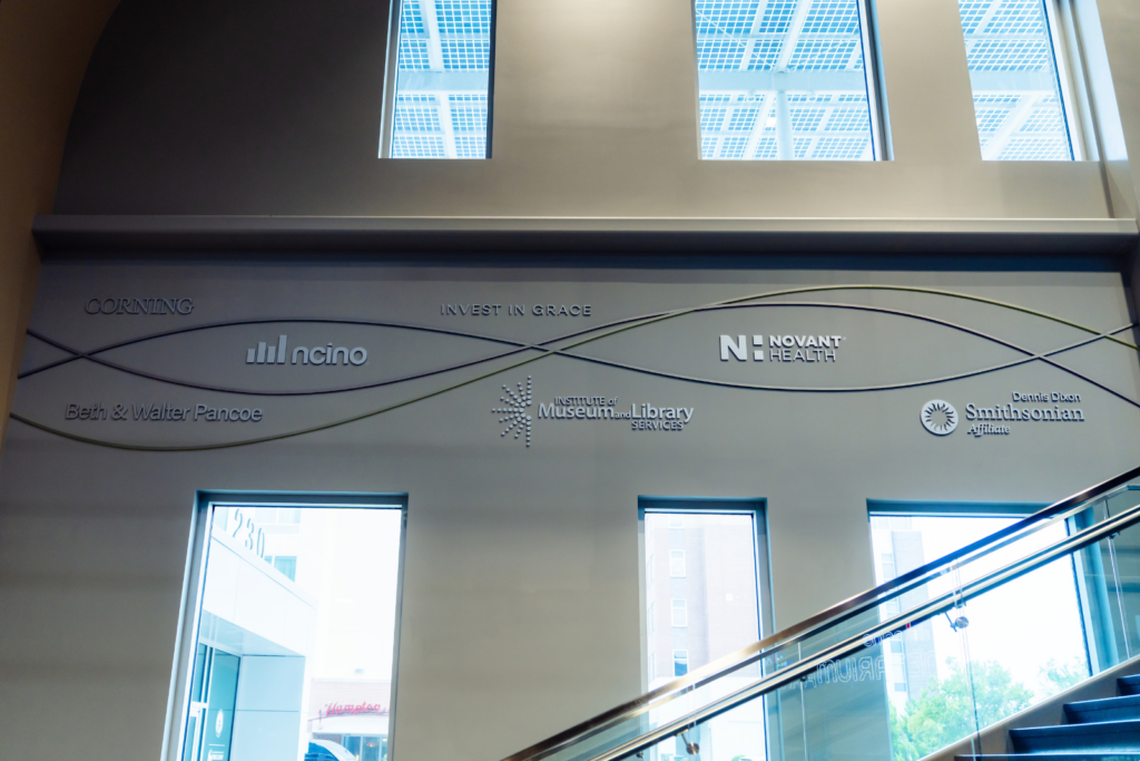
The donor recognition wall presented a different design opportunity. Recognizing the people and organizations that helped make the new museum possible was important, and Jeff found a creative way to make that recognition a prominent part of the space. He identified a wall near the entrance stairs and developed a custom design that turned it into a distinctive donor display.
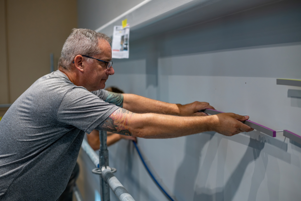
Our team then had to turn that design, which included painted acrylic and PVC elements with different colors and finishes, into a finished installation.
“You all did a beautiful execution of that sign,” Jeff said of our team. “You hit it perfectly.”
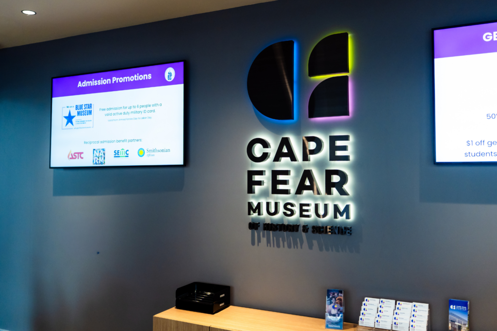
The donor recognition wall presented a different design opportunity. Recognizing the people and organizations that helped make the new museum possible was important, and Jeff found a creative way to make that recognition a prominent part of the space. He identified a wall near the entrance stairs and developed a custom design that turned it into a distinctive donor display.
Our team then had to turn that design, which included painted acrylic and PVC elements with different colors and finishes, into a finished installation.
“You all did a beautiful execution of that sign,” Jeff said of our team. “You hit it perfectly.”
Figuring Out How to Build It
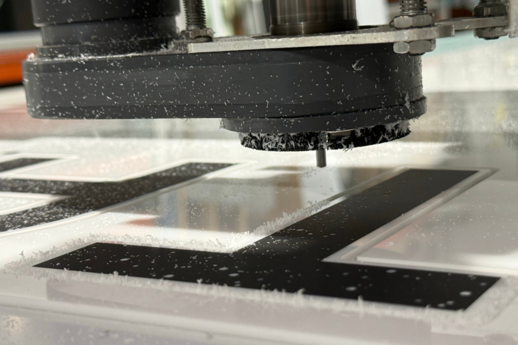
Of course, a design on a screen and a finished dimensional sign are two very different things.
For many of the major pieces, our Lead Designer Rebecca Diak worked from Morvil's concepts, making the production adjustments needed to fabricate them while maintaining the original design. Other specialty graphics came to us through additional exhibit and project partners.
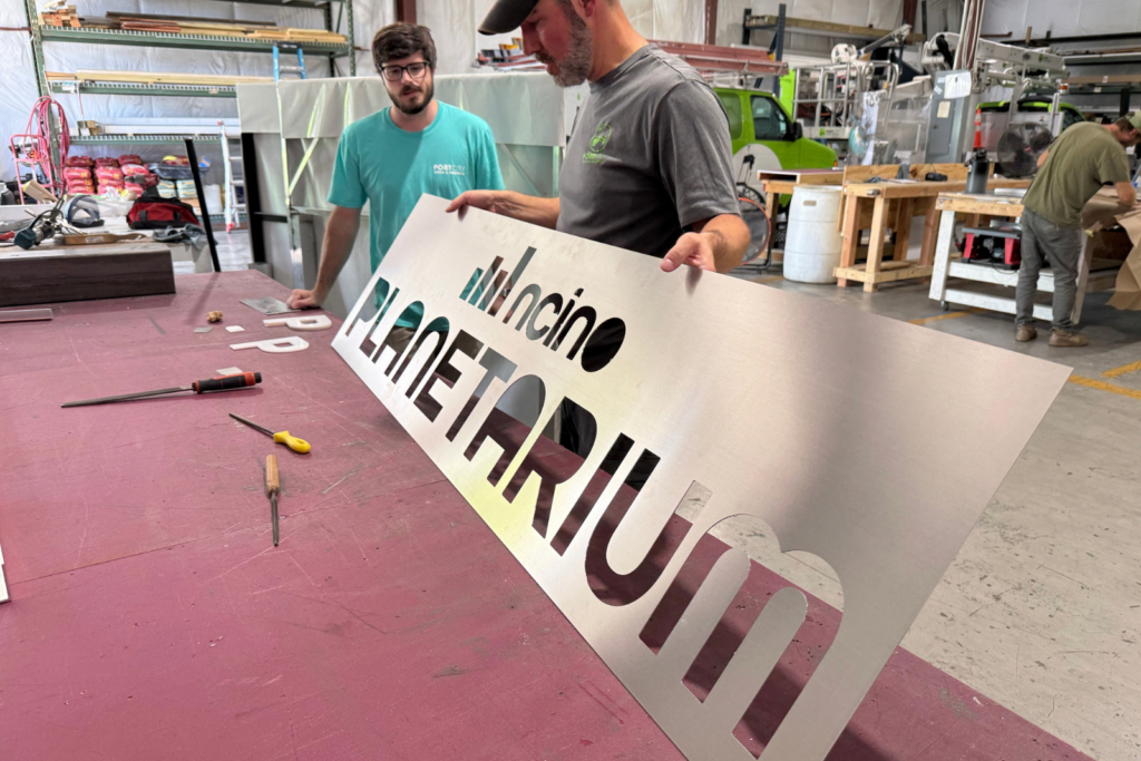
That meant working with wood, acrylic, PVC, stainless steel, translucent vinyl, painted elements and illumination, sometimes all within the same project.
Since our swissQprint flatbed printer allows us to add dimensional printing directly to many of those materials in-house, the range of signs needed for the museum gave us the opportunity to expand on how we were already using that technology.
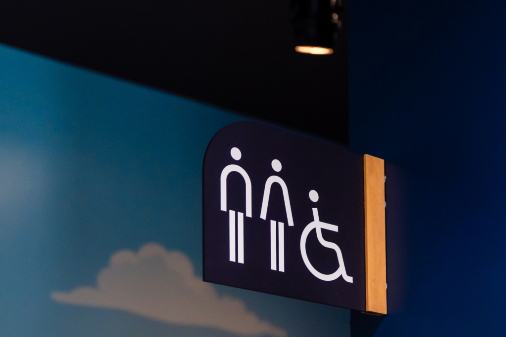
“The ADAs were cool because they involved wood and acrylic,” Rebecca said. “We got to expand how we were using the dimensional printing, including printing directly on acrylic.”
Different materials required different approaches to get the finished look we wanted. The wood signs, for example, needed a particular stained appearance, but traditional wood stain prevented the swissQprint ink from adhering properly. Instead, the team developed a solution using a tinted paint to create the look while still allowing the dimensional printing to adhere.
A Lot of Moving Parts and One Opening Date
The fabrication wasn't the only challenge. With multiple partners involved and designs moving through the approval process, there were plenty of pieces that had to come together before opening day.
Jeff said our team stayed responsive throughout the project and, most importantly, met the deadline despite the complexity of the work.
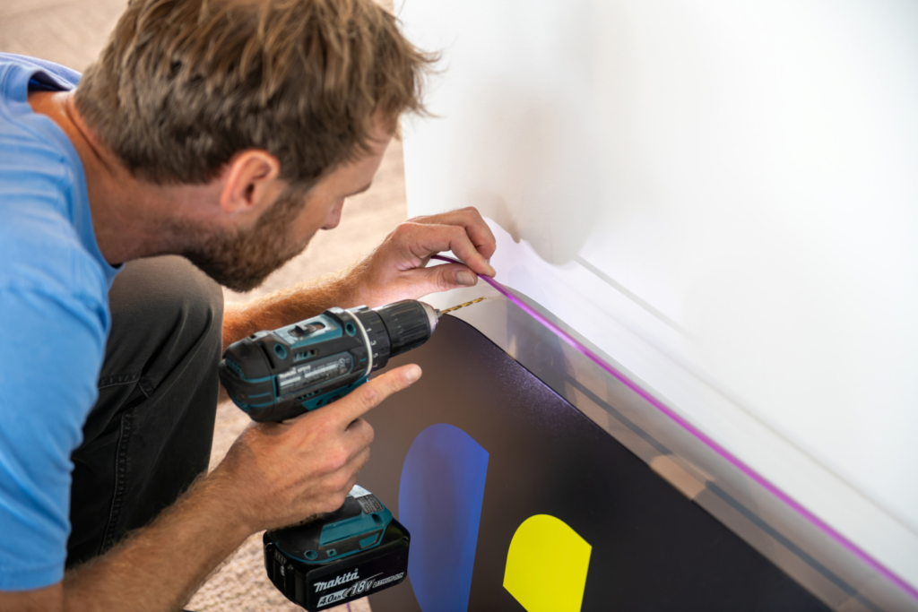
“One of the main reasons I like working with Port City is that you all like to be challenged,” he said. “You don't give up.”
That willingness to keep working through a problem was especially important on a project where no two types of signs were quite the same.
Helping Visitors Experience the Museum
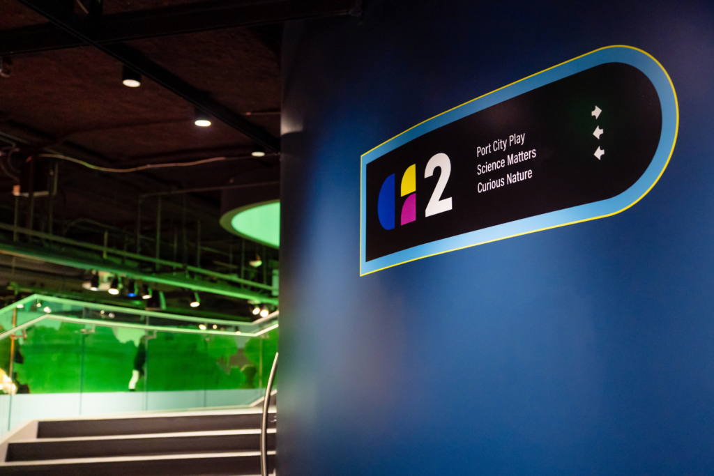
For all the materials, fabrication methods and production challenges behind the scenes, the finished signs ultimately have a much simpler job… help people experience the museum.
“This is a very large facility, so I think it can be intimidating for a first-time visitor that may not know where to find things,” Barbi said. “The more we can make it feel intuitive and easy for them to navigate and find their way, the better.”
That’s ultimately what all of the work behind the scenes was leading to. Visitors don’t need to think about how a sign was fabricated, how many materials went into it or what it took to get the details just right. That’s our job. They simply need to be able to find their way through the museum and enjoy everything it has to offer.
Do you have a complex signage project involving multiple materials, custom fabrication or a few challenges that still need to be figured out? We’d love for you to get in touch with us. We like those types of projects.